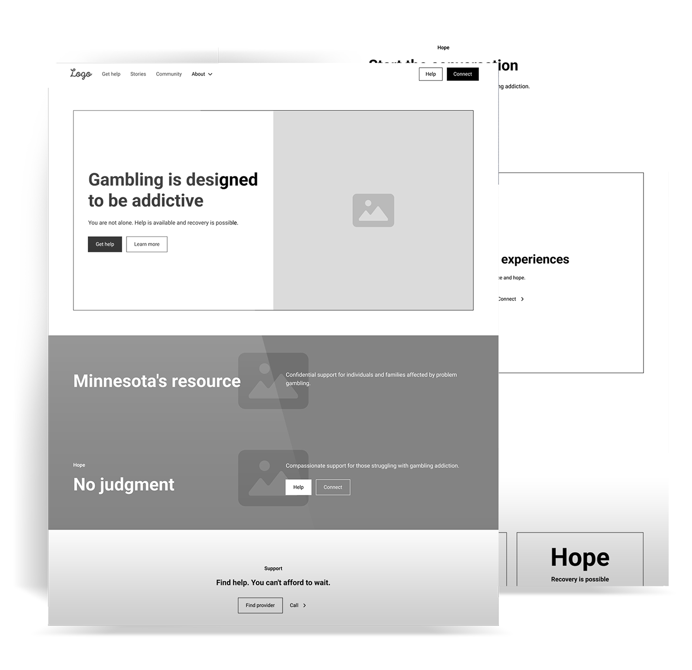
Resources were scattered and out of date. People in crisis could not find a number to call or a plan to follow. The site needed clear steps and a kind voice.
I worked with the team to center three paths. For yourself. For someone you love. For counselors and community. Helpline, text, chat, and a provider search sit up front. The site leads with hope and plain talk.
Reach people who are stressed and often on a phone. Cut the clutter. Put help options first. Keep the reading level low and the path simple.
I led UX, UI, and front end from kickoff to launch. I mapped flows and built wireframes in Figma. I designed screens in Figma and prepared icons in Illustrator and images in Photoshop. I built on WordPress with HTML, CSS, and JavaScript, using a light touch of jQuery for the search and prompts.
Calls, texts, and searches grew. People reach help in fewer steps and spend more time on the right pages. The site now meets people where they are and guides them to a next step that feels possible.

The homepage starts with Get Help Now. Clear routes split by audience. Short sections and big buttons keep focus and reduce drop off.

Clean type and high contrast make reading easy. Photos show real people. Simple graphics explain self checks without fear. Copy is direct and supportive.

WordPress with custom templates. Images are small and code is trimmed so pages load fast on any connection. Menus and forms work by keyboard and screen reader. I added a provider search tool, SMS links, and a chat widget. Events are tracked so the team can see what helps.

Calls, texts, and searches grew. People reach help in fewer steps and spend more time on the right pages. The site now meets people where they are and guides them to a next step that feels possible.