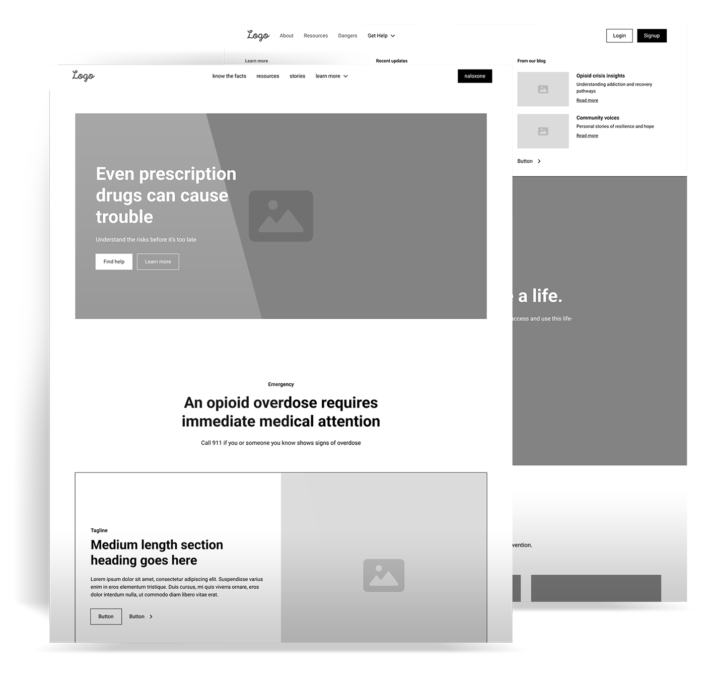
This Minnesota Department of Human Services (DHS) project was more than just a site refresh—it was a thoughtful, strategic transformation aimed at creating a more effective and accessible resource for individuals seeking information on opioid misuse.
Using insights from user behavior, heatmaps, interviews, and SEO audits, we implemented targeted UI changes that significantly boosted conversions and performance. The redesigned site now serves as a powerful tool for raising awareness and connecting users with essential resources.
The original Know the Dangers site struggled with usability challenges stemming from a cluttered design, outdated content, and inconsistent structure. These issues made it difficult for users to find the critical information they needed. Adding to the complexity, custom features had to be integrated within a limited development framework.
As the lead designer and developer, I took ownership of the site’s creation from start to finish. By hand-coding with HTML, CSS, JavaScript, Bootstrap, and jQuery, I crafted a responsive, custom platform tailored to Go By Truck’s unique vision. The result was a seamless user experience that aligned closely with their application’s functionality, ensuring the website became an extension of their innovative approach to transportation.
Through thoughtful analysis, we set key objectives to align the website with user needs and enhance their overall experience:
Key UX and SEO insights guided the redesign:
The redesign transformed Know the Dangers into a trusted resource, blending accessibility with user engagement, and redefining how users connect with critical support information.
Before the redesign, the site’s cluttered layout, complex navigation, and lack of mobile optimization limited usability. A cleaner, more intuitive layout with strategic CTAs like “Find Naloxone” and “Get Help Now” improved access and engagement on key pages.
I guided the redesign based on data-driven decisions. UX and SEO insights highlighted the need for improved mobile responsiveness, CTA placement, and sustained engagement strategies, leading to a sticky header, reorganized content, and optimized CTAs.
Our development phase emphasized mobile responsiveness and user interactions, particularly on key pages like Naloxone Finder. These changes enhanced usability, connecting users effectively with vital information.
The transformation of Know the Dangers demonstrates the value of effective UX design and ongoing development. By addressing initial issues and leveraging data insights, we built a platform that not only improves user experience but also furthers the organization’s mission to support individuals affected by opioid misuse.