KFI Engineers came to this project with a WordPress site that had been stretched past its limit. Over the years, new pages and sections had been bolted on, leaving a heavy menu, long walls of text, and an experience that made it hard to see what KFI actually does. Services, markets, projects, and careers were all there, but they were buried. On phones, the site felt cramped and slow, which was a problem for both prospective clients and people looking for roles.
The goal was to keep the content but give it a cleaner structure and a more modern home. We stayed on WordPress and rebuilt the site on a custom theme with a clearer navigation, consistent templates, and a stronger focus on services, projects, and careers. I set up Elementor and Advanced Custom Fields so the KFI team could manage content through simple fields instead of fighting layouts. The result is a site that now reflects KFI’s work, is easier to maintain, and actually supports hiring and business development instead of getting in the way.
We had to reorganize a large, live site while keeping it online and familiar enough for repeat visitors. KFI needed a site that could:
All of this had to happen without losing existing content or search equity.
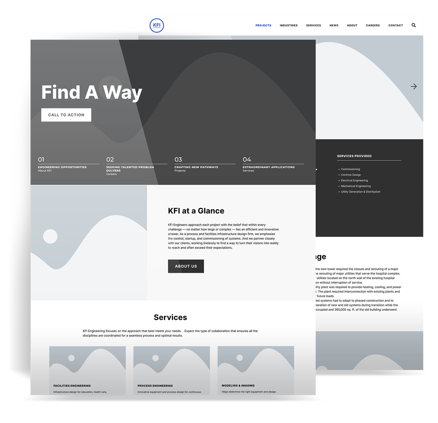
I led UX, UI, and front‑end development from discovery through launch. I started by talking with stakeholders, reviewing analytics, and mapping what content existed and how people were using it. From there I reworked the information architecture, grouped pages into clearer sections, and built wireframes in Figma to show the new paths for clients, candidates, and partners.
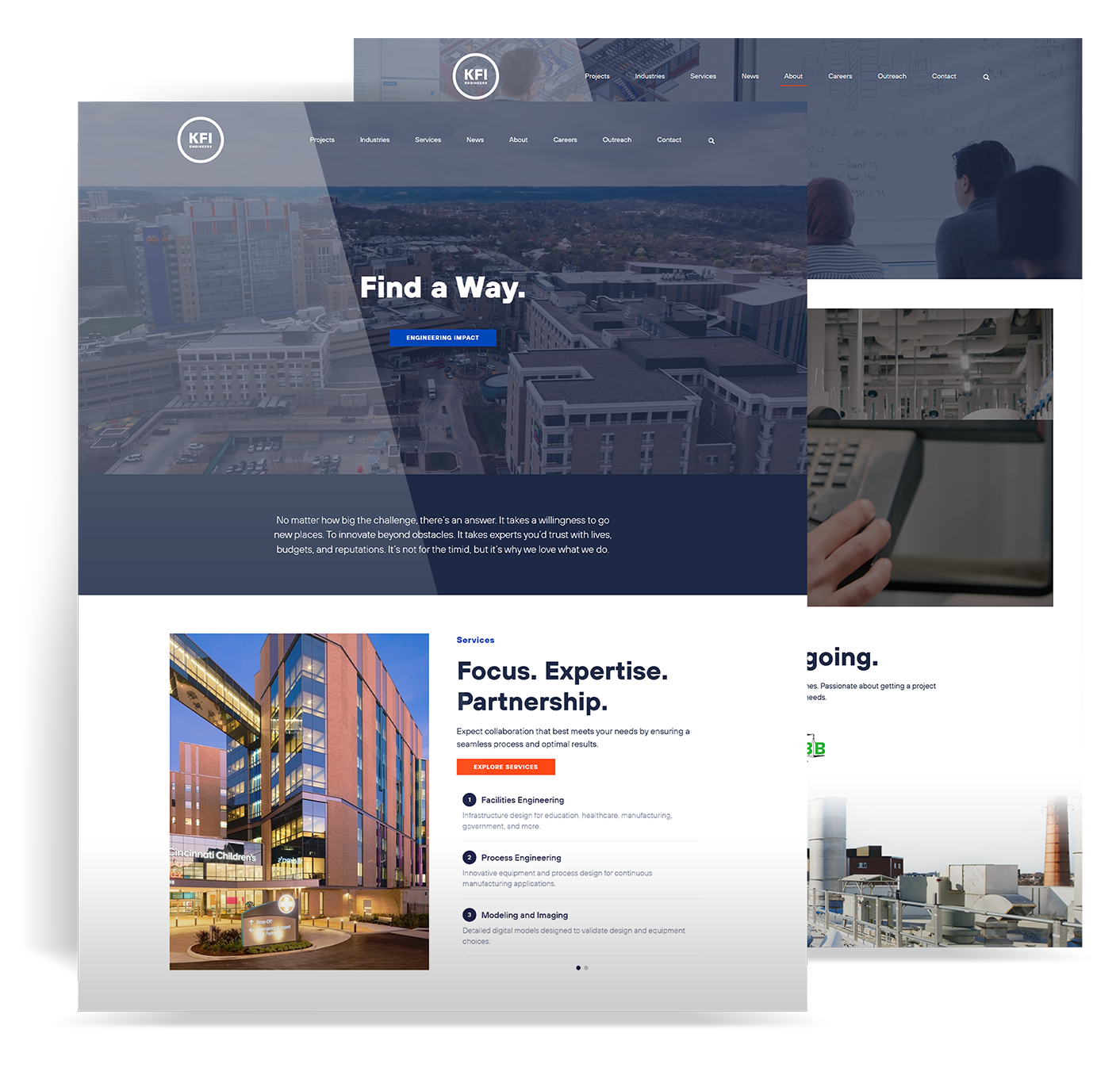
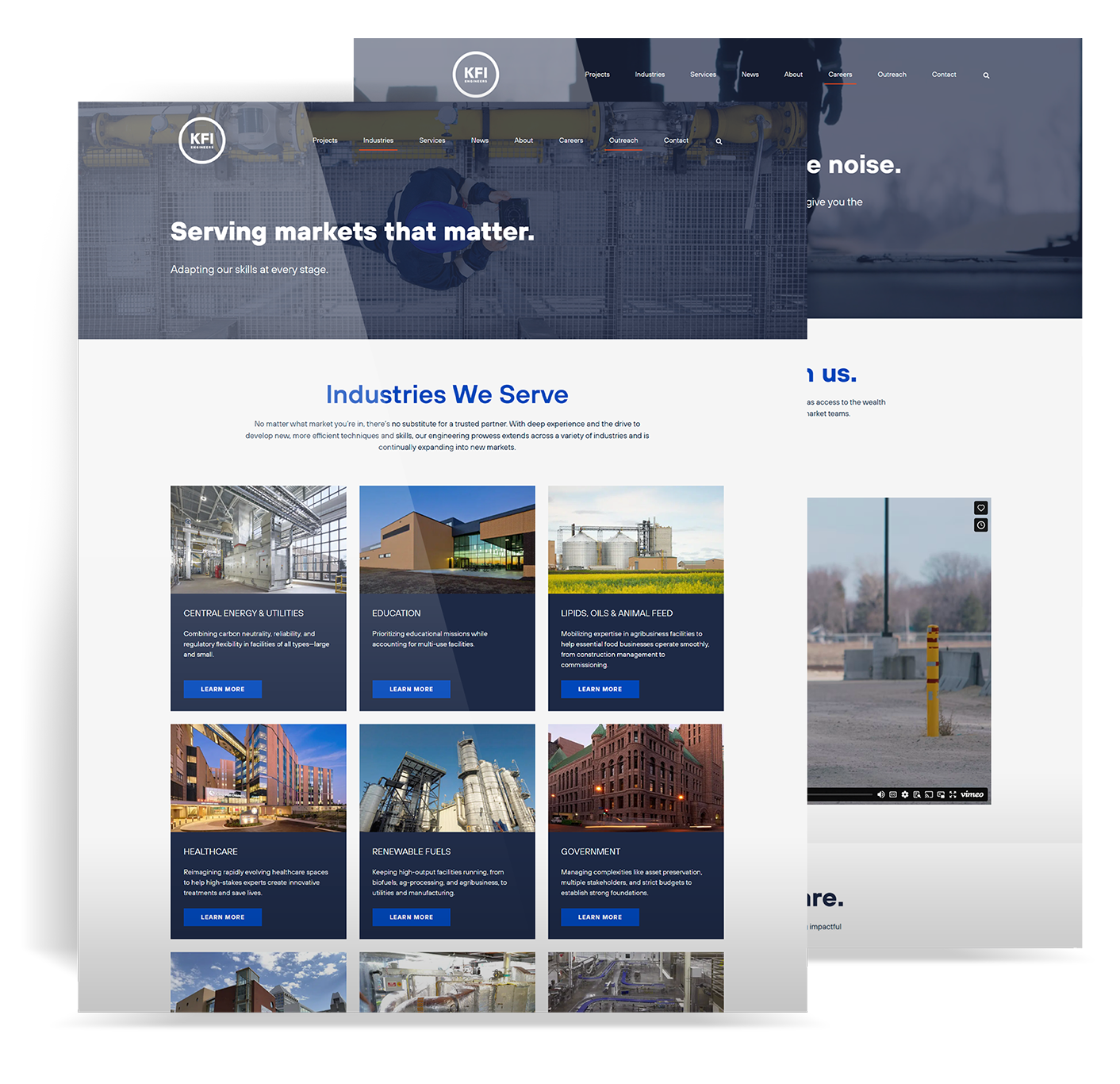
On the design side, I created the updated UI in Figma using KFI’s brand as the base, with fresher layouts, more white space, and better use of project and people photography. On the development side, I built a custom WordPress theme, set up Elementor and ACF for reusable blocks, and wrote the front end in HTML, CSS, and JavaScript. I also handled content migration, redirects, SEO basics, and launch support.
The new KFI Engineers site is easier to navigate and easier to keep current. Visitors can quickly see what KFI does, browse relevant projects, and get a sense of the team behind the work. The Careers section is now a clear entry point for candidates, and KFI has seen stronger engagement from people exploring roles and submitting applications.

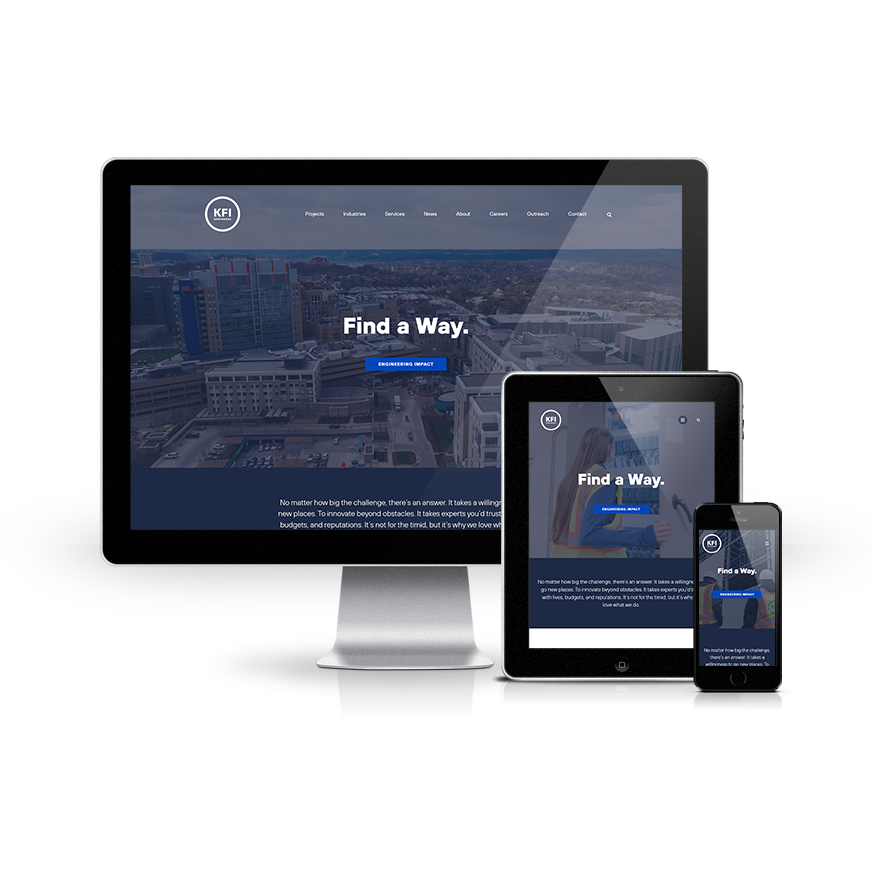
The first step was to simplify navigation. I reduced the menu to a few core sections – Services & Markets, Projects, People, Careers, and Contact – and gave each its own set of templates. Case studies, staff profiles, and service pages all follow predictable patterns so visitors know where to look. Because a lot of visitors come in on mobile, I sketched the main flows for small screens first. On phones, actions like “View openings,” “Contact,” and “Browse services” sit high on the page. Content is broken into smaller sections so people can scan quickly instead of wading through long blocks of text.

Visually, the new site needed to feel current without losing KFI’s stability and professionalism. I used their colors and typography in a cleaner layout, with clear hierarchy and high‑quality photos of real projects and team members. Under the hood, I defined reusable components – hero sections, project cards, staff bios, callouts – and implemented them as Elementor widgets and ACF field groups. Editors can now build new pages by filling in structured fields and choosing components, and the design stays consistent across the site.

In WordPress, I set up custom post types for Projects and People along with taxonomies to connect them to services and markets. I migrated content from the old theme into the new structure using a mix of imports and manual cleanup, updating copy and formatting as we went.
I optimized images, trimmed CSS and JavaScript, and enabled caching to make pages load faster. I tested menus, filters, and forms across browsers and devices, and wired up analytics so KFI could see how visitors move through services, projects, and careers. Before launch, I trained the team on using the new blocks, templates, and fields so they could own the site day to day.

The new KFI Engineers site is easier to navigate and easier to keep current. Visitors can quickly see what KFI does, browse relevant projects, and get a sense of the team behind the work. The Careers section is now a clear entry point for candidates, and KFI has seen stronger engagement from people exploring roles and submitting applications.