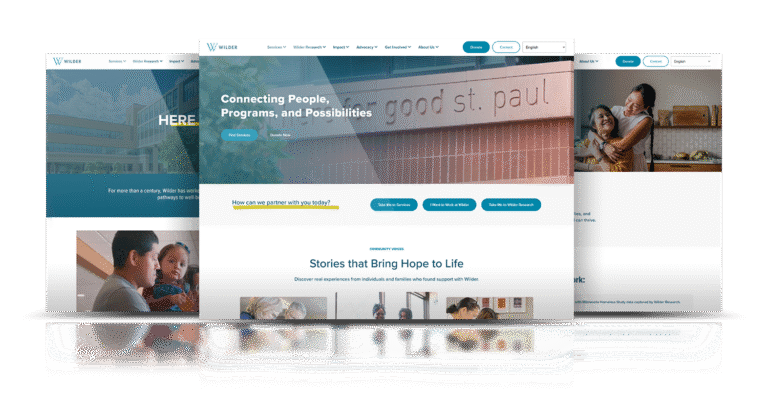
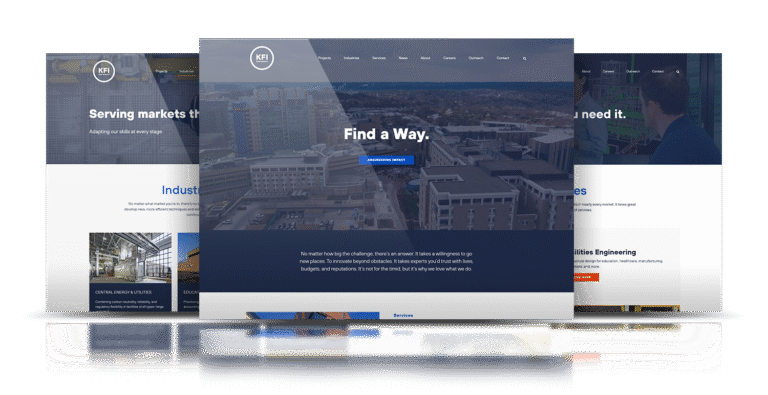
Project phase

Rethinking Nycor

Growing Nycor

The old site looked busy and felt dated. Key paths were hard to find, and the phone experience slowed people down. Both candidates and employers left before taking action.

I studied behavior with the team and rebuilt the experience around two clear paths. One for people looking for work. One for companies that need talent. We cut noise, fixed the structure, and rebuilt the site on WordPress so it is fast and easy to use.

Visit Website

Nycor - Before Website Redesign and Rebuild
Nycor Website Design - UXUI
Project phase

The Challenge

Serve two groups without sending either in circles. Jobs and services were buried, the menu was confusing, and forms were heavy on phones. The goal was simple. Short paths to search, apply, and contact the team, with copy that sets the right expectations.

My Role

I led UX, UI, and front end from kickoff to launch. I ran a quick audit, mapped flows, and built wireframes in Figma. I created comps and assets in Figma and Photoshop, with icons in Illustrator. I built a custom WordPress theme and wrote HTML, CSS, and JavaScript, using a light touch of jQuery for interactions. Every step kept design and build in sync so choices held up in the browser.

Concept to Creation

Advanced Web Design Techniques

CSS
Development
Graphic Design
HTML
Information Architecture
jQuery
Product Design
Prototyping
SEO (Search Engine Optimization)
User Experience
User Journey
UX/UI Design
Web Design
Wireframing (UX/UI)

People now find what they came for and act on it. Traffic doubled and conversions tripled. Candidates apply with less friction, and employers reach out more often. The site finally matches how NYCOR works. Clear. Fast. Built to help people move.

Wireframes and User Interface

From the homepage, two direct routes. Job seekers reach open roles in a tap or two. Employers reach a simple request form or service overview just as quickly. Clean menus, clear headings, and visible calls to action keep people moving.

Design and Customization

A plain layout with readable type and honest imagery sets the tone. Color and spacing guide attention. Forms are short. Motion stays light so pages feel quick on any connection. Assets were prepared in Figma, Photoshop, and Illustrator to keep the system consistent.

Development and Implementation

I built on WordPress so the team can update jobs and content without help. Custom templates replace heavy plugins. I hand coded the front end with HTML, CSS, and small JavaScript. Images are compressed and code is trimmed, which makes pages load fast on any device. Menus work by keyboard and touch. I tested across browsers and screen sizes and fixed issues before launch.

Nycor Website Design - UXUI

Outcome:

People now find what they came for and act on it. Traffic doubled and conversions tripled. Candidates apply with less friction, and employers reach out more often. The site finally matches how NYCOR works. Clear. Fast. Built to help people move.

Visit Website

Related Projects: