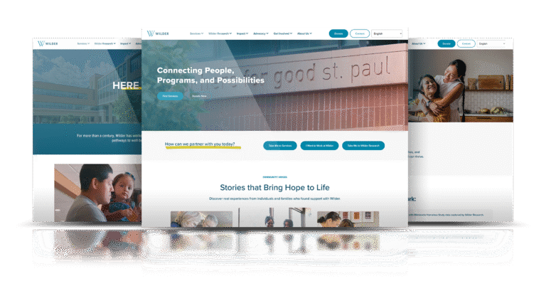
Sycamores is a long‑standing nonprofit that supports children and families. Their old site made that work harder than it needed to be. Pages were crowded, the menu was confusing, and it was tough for families in crisis to find help or for donors and volunteers to know how to get involved. Accessibility was also a problem. Inconsistent design and old code made it difficult for people on phones, tablets, or with assistive tech to use the site with confidence.
We set out to turn the site into a calm, clear place where people could get help and give help. I worked with Sycamores to restructure content around real tasks: find services, learn about programs, give, and volunteer. We rebuilt the site on WordPress with a cleaner layout, stronger mobile behavior, and better support for staff who need to update content. The new experience keeps the focus on families while making it easier for the organization to tell its story and reach the people it serves.
Sycamores needed a site that could carry a lot of history and many programs without overwhelming visitors. The old navigation tried to do everything at once. Families under stress struggled to find “Get Help,” and supporters had to dig to find ways to donate or volunteer. At the same time, the site had to meet current accessibility standards and work with existing tools for giving, events, and careers. The core question was how to present a large, serious organization in a way that feels simple, kind, and easy to act on.
I led UX, UI, and front‑end development from the first workshops through launch. I met with program staff and stakeholders, listened to how families use the site, and reviewed analytics to see where people were getting stuck. From there I mapped a new information architecture, then built wireframes in Figma to plan paths for key audiences: youth and families, donors, volunteers, and staff.
Once we agreed on the structure, I handled the visual design and then built the front end on top of WordPress. I customized the theme with HTML, SCSS/CSS, and JavaScript, used Elementor for flexible layouts, and wrote custom code where we needed more control. I also coordinated content migration, accessibility checks, and launch planning.
The new Sycamores site is now a real support tool, not just a brochure. Families can reach services faster, donors and volunteers can see where they fit, and staff can publish updates without needing a developer. Early use has shown more people reaching “Get Help” and giving pages, and fewer visitors dropping off in the first click or two.
Most importantly, the site now feels like Sycamores: caring, steady, and clear. It extends their work online and makes it easier for more children and families to find a path to support.
In wireframing, the focus was on reducing stress for visitors. Programs and Services got clear section pages. “Get Help” and “Donate” sit in obvious spots so families and supporters do not have to hunt. I grouped content into logical chunks, cut down the menu, and gave each page type a steady structure. All flows were sketched phone‑first. On smaller screens, key actions sit near the top and content is broken into smaller pieces so people can scan quickly.
For the visual design, I aimed for warm and clean. I used Sycamores’ colors in a softer palette, with plenty of white space and large, readable type. Photography and illustration focus on hopeful images of children, families, and care instead of heavy stock imagery. Icons and simple graphics help explain programs without a wall of text. I built a UI kit and style guide in Figma and then translated that into reusable components: section headers, content blocks, cards for programs, staff, and stories.
I built the site on WordPress with a heavily customized theme. Page templates were coded with HTML5 and CSS3, using SCSS to manage the styles. I used JavaScript and jQuery for parts like tabbed FAQs and multi‑level navigation that still needed to work well on touch devices. Elementor was wired in where the team needed drag‑and‑drop control, but core layout and styling live in the theme.
Throughout development, I cut image sizes, minified scripts and styles, and set up a content delivery network so pages load faster, especially for users in Southern California. I ran accessibility checks, made sure menus and forms work with screen readers and keyboards, and fixed issues found in cross‑browser and device testing. Donation forms, analytics, and basic SEO settings were set up so Sycamores could see how people use the site and adjust over time.
The new Sycamores site is now a real support tool, not just a brochure. Families can reach services faster, donors and volunteers can see where they fit, and staff can publish updates without needing a developer. Early use has shown more people reaching “Get Help” and giving pages, and fewer visitors dropping off in the first click or two.
Most importantly, the site now feels like Sycamores: caring, steady, and clear. It extends their work online and makes it easier for more children and families to find a path to support.